Suggestions
:speech_balloon:
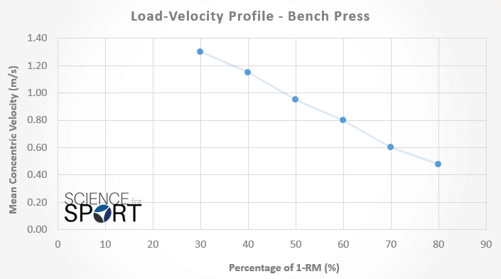
Graph of mean velocity by intensity in charts page
Based on some articles on velocity based training, it seems that there is a linear relationship between load on the bar and mean velocity. It would be cool if we could get a load vs mean velocity graph in the charts page. If the fastest rep of each working set was plotted as a data point we could get a good idea of our individual slope for each exercise and get good 1rm recommends. The plot would look something like the link attached but with load in stead of percentage and maybe even a line of best fit.

